The Task:
To re-brand one of the leading quality jewellers in the UK, Goldsmiths.
To re-brand one of the leading quality jewellers in the UK, Goldsmiths.
Context:
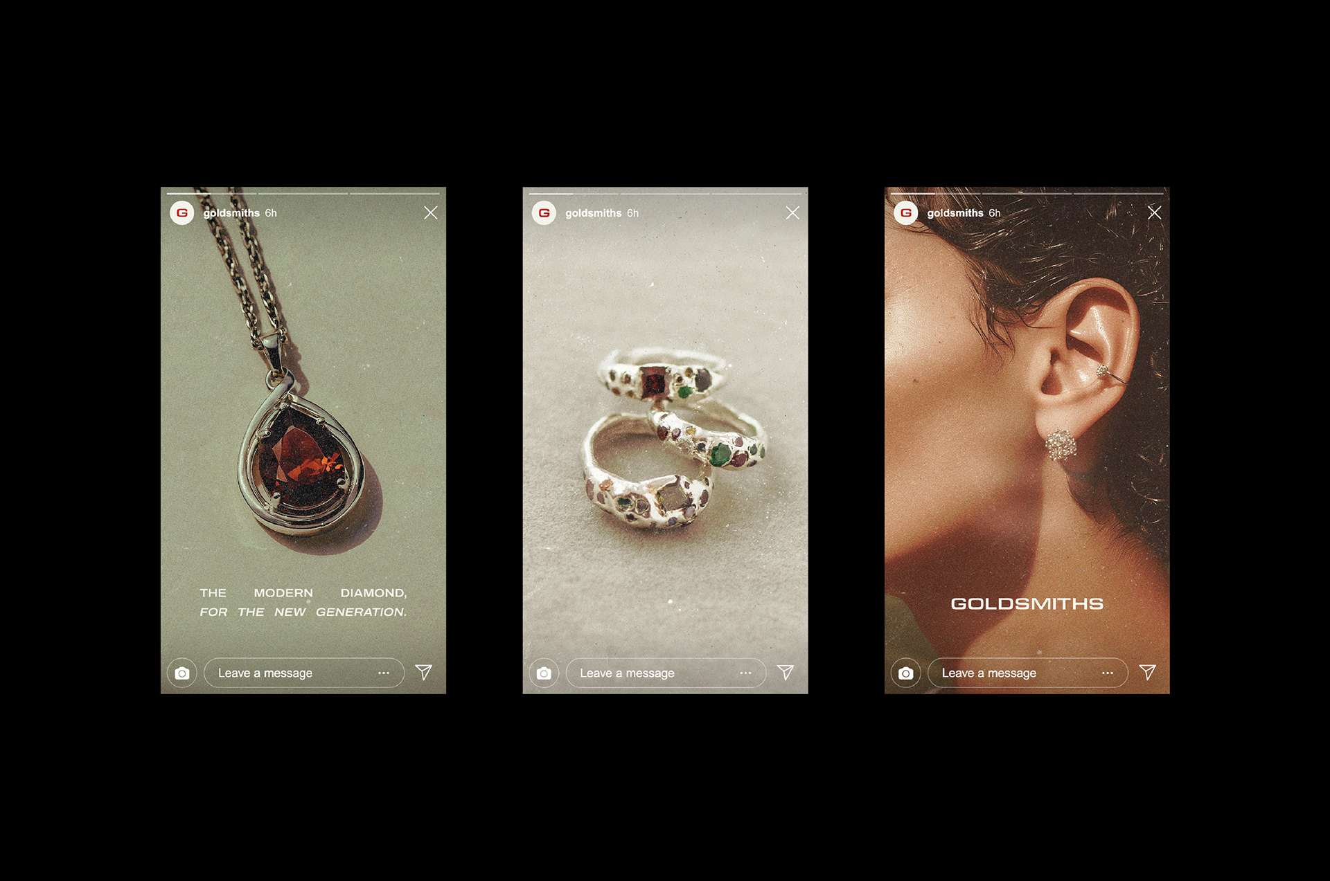
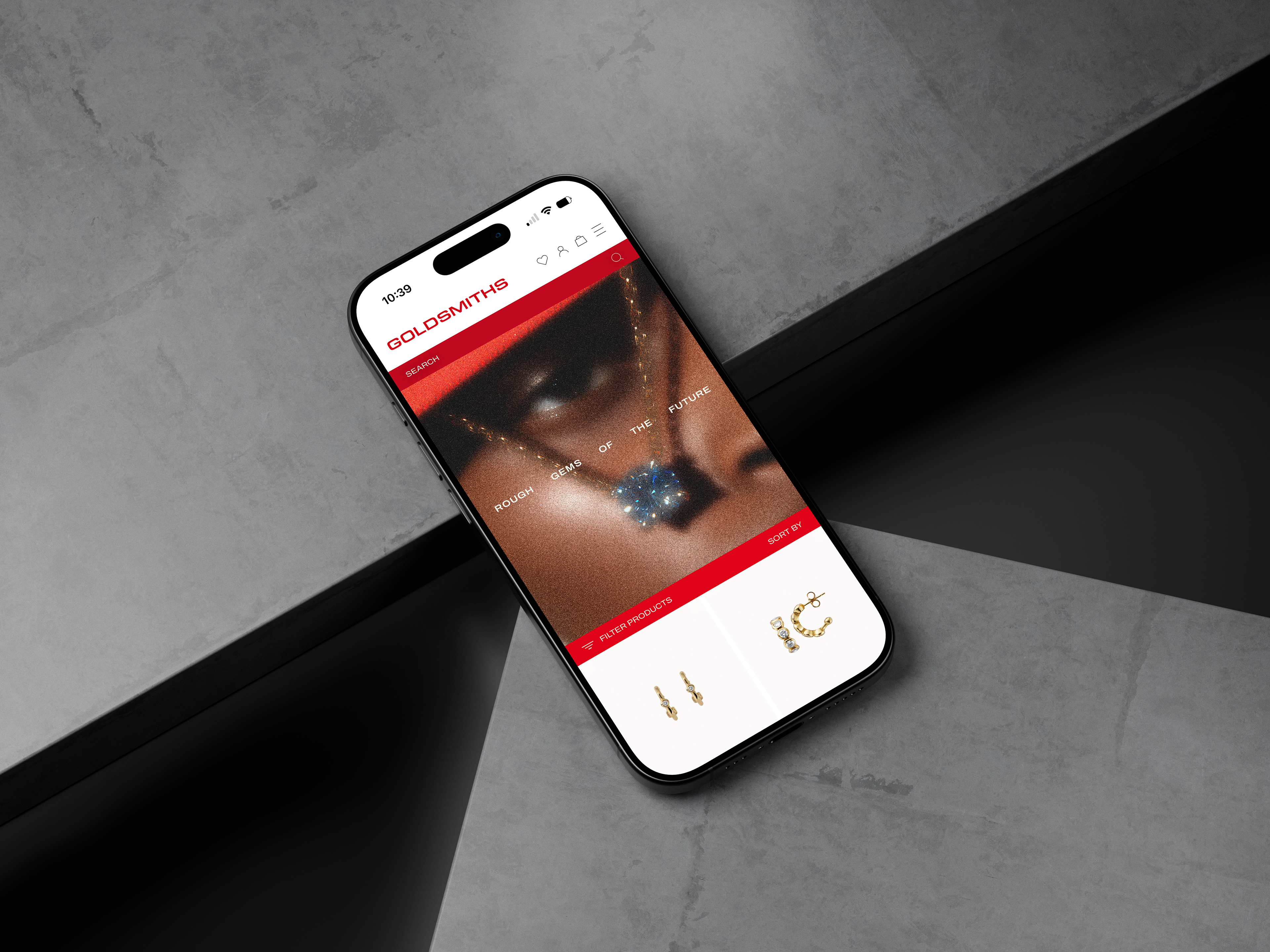
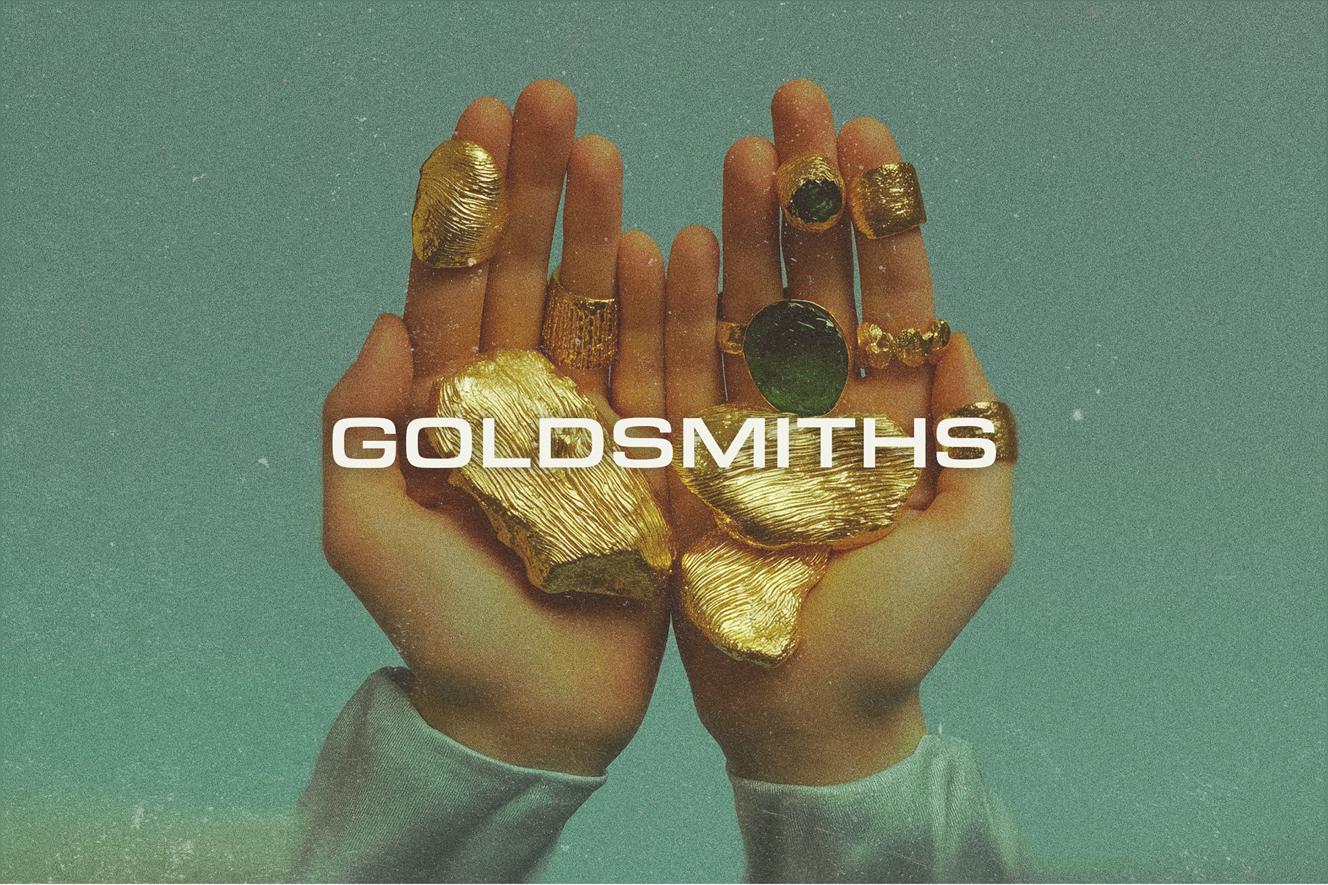
Diamonds used to be a girl’s best friend, but it seems that Gen Z has outgrown them. Studies show that the jewellery industry struggles to move forward, change the generational nuances and continues to market to Baby Boomers. We all like a story, but this rebrand moves away from myths and romance. It’s been done over and over again. Instead, I wanted to re-imagine Goldsmiths as an environmentally conscious, non-traditional, and contemporary brand that speaks to the rough diamonds of the future, cutting through the noise with a simple but genuinely effective brand positioning that redefines this saturated market.
The Solution:
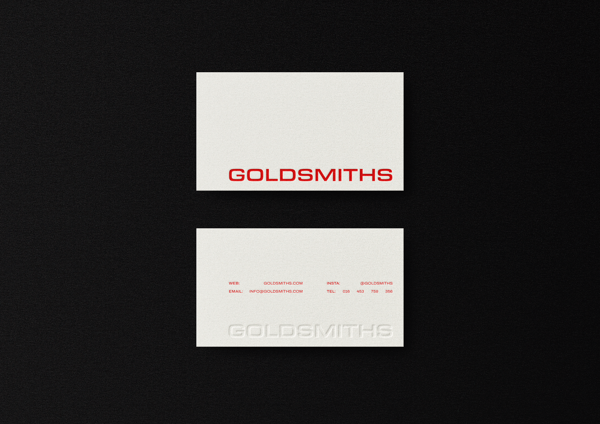
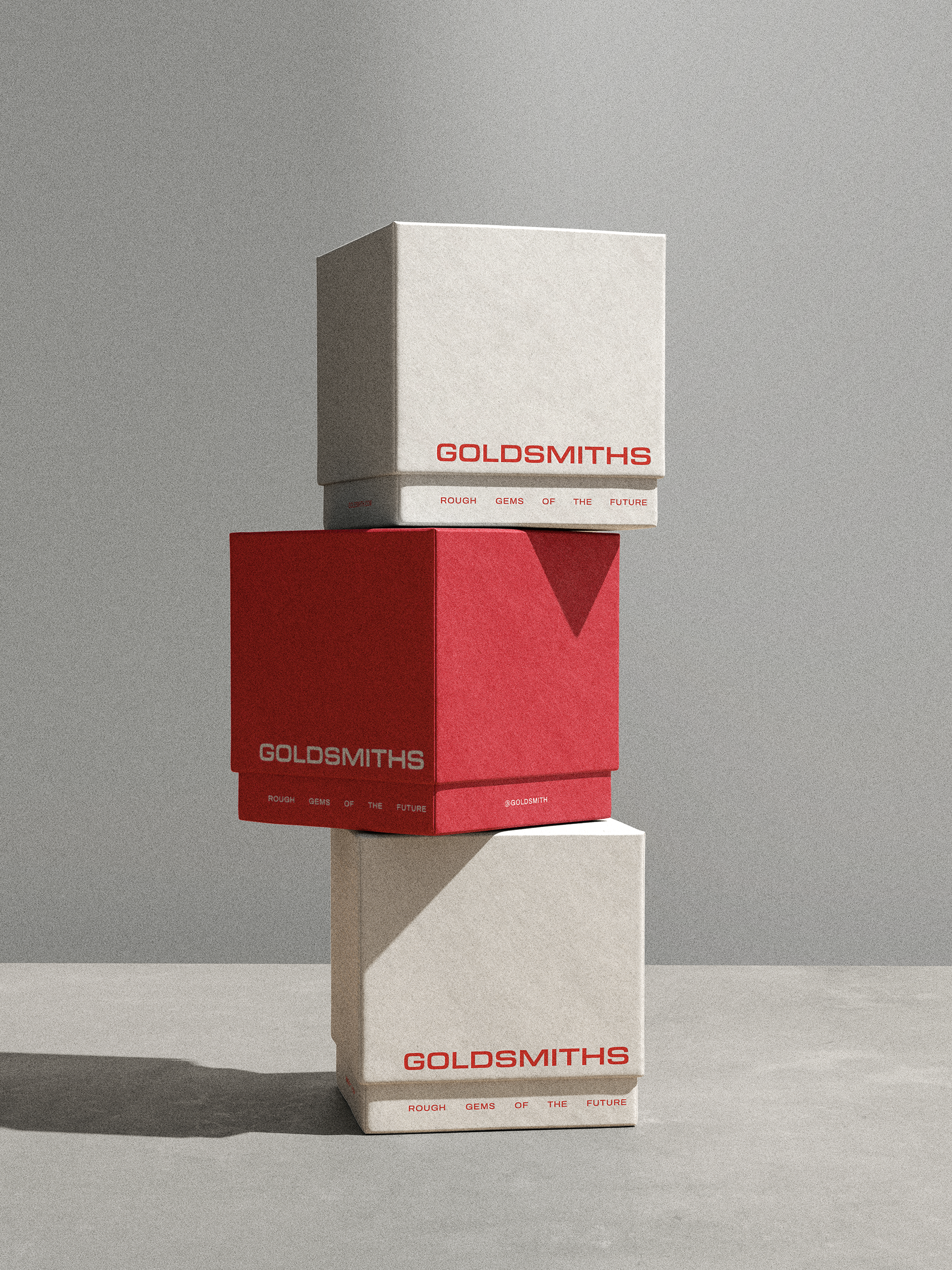
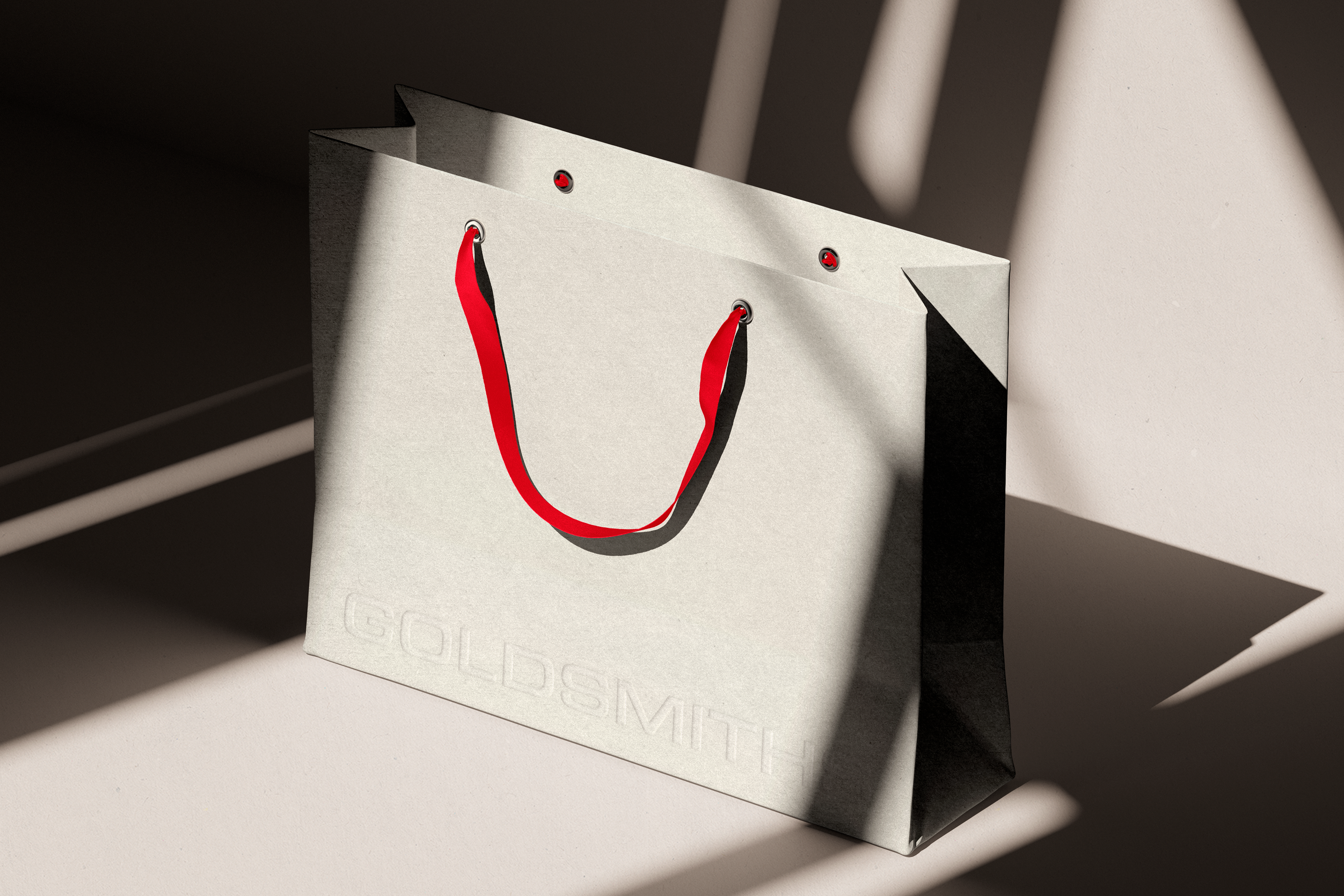
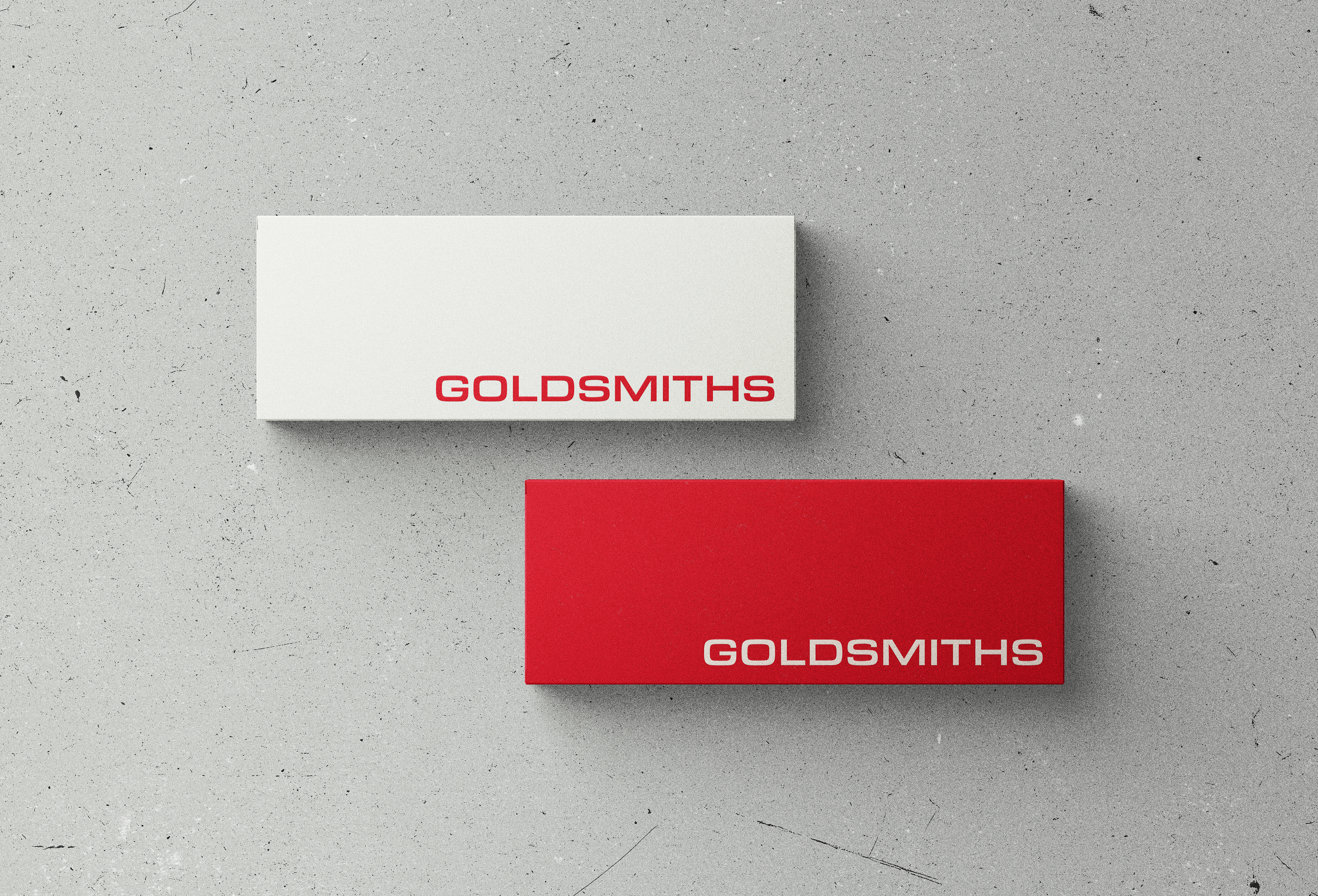
▫️ A bold typeface and colour palette
▫️ Minimal and spacious typography layouts for advertisement and packaging
▫️ The use of striking images overlayed with a grainy, vintage texture conveying
the 'rough diamonds of the future'
Diamonds used to be a girl’s best friend, but it seems that Gen Z has outgrown them. Studies show that the jewellery industry struggles to move forward, change the generational nuances and continues to market to Baby Boomers. We all like a story, but this rebrand moves away from myths and romance. It’s been done over and over again. Instead, I wanted to re-imagine Goldsmiths as an environmentally conscious, non-traditional, and contemporary brand that speaks to the rough diamonds of the future, cutting through the noise with a simple but genuinely effective brand positioning that redefines this saturated market.
The Solution:
▫️ A bold typeface and colour palette
▫️ Minimal and spacious typography layouts for advertisement and packaging
▫️ The use of striking images overlayed with a grainy, vintage texture conveying
the 'rough diamonds of the future'